Early cars were brutally simple. Engineers cared about one thing: making the machine go. Design, comfort, usability? Those didn’t matter. Manufacturers slapped engines into light carriages, bolted bicycle wheels to the corners, and called it a day. The result was a “horseless carriage” in the truest sense. Aside from a steering wheel, pedals, and maybe a handbrake, there was nothing. The dashboard—named for the board that stopped horse hooves from dashing mud into the driver’s face—was completely empty.
Then came 1902. The speedometer arrived. It sat near the wheel. It told you how fast you were going. That was it. One gauge. A massive leap forward because, before that, you had no idea if you were creeping along or tearing up the road. Safety improved simply because visibility of speed existed.
Look at a dashboard today. It’s cluttered. Speed, RPMs, oil pressure, coolant temp, seatbelt reminders. Climate control systems let you zone the temperature. We’ve added layers of complexity to keep the engine happy and the driver comfortable. But now, the conversation has shifted. Global temps are rising. Gas prices are wild. People want alternatives to heavy carbon emitters.
Enter the gasoline-electric hybrid.
Hybrids aren’t just swapping the engine; they’re changing the interface. They’re feeding you data. Traditional gauges stay, sure. Speed and RPMs remain. But hybrids add a new layer: hybrid system indicators. These screens track real-time fuel economy and battery levels. They tell you exactly how the powertrain is behaving.
So, do these displays just show off tech? Or do they actually help you drive better? Can reading a screen make you more efficient?
What Hybrid System Indicators Actually Show You
The goal isn’t just information. It’s behavior modification. When you see exactly how much power you’re wasting, you stop wasting it. The display bridges the gap between the mechanical process and the driver’s foot.
You get stats on:
– Real-time fuel consumption
– Battery charge levels
– Power flow (whether you’re drawing from the battery or charging it)
It’s not just a dashboard anymore. It’s a feedback loop. You press the gas. The screen reacts. You see the cost of that acceleration instantly.
Does it work? That’s the question. Can a digital readout make a human driver smoother? Or is it just another thing to glance at while merging onto the highway?
Reading the Hybrid Dashboard for Maximum Efficiency
Older gas guzzlers kept it simple. A foam float bobbed in the tank, dragging a metal wiper across a resistor. The more fuel you burned, the further that wiper slid, changing the electrical resistance. That change told the needle to dip toward empty. It was analog, mechanical, and brutally straightforward.
Hybrids? Not so much.
Modern hybrids run on microprocessors. The computer doesn’t just read a resistor; it interprets data from a dozen different sensors. The goal isn’t just to tell you how much gas is in the tank. It’s to show you the complex dance between the gasoline engine and the electric motor.
The main draw to hybrid system indicators is that they’re multi-informational.
You get battery life. You get fuel economy. You get real-time feedback on how efficiently the car is converting energy. Most of these displays are customizable, letting you choose exactly which metrics matter to you.
For the enthusiast who wants to hypermile with a hybrid, this data is gold. You aren’t guessing. You’re seeing exactly when the engine kicks in, when the battery drains, and how your driving style affects the bottom line.
Understanding the Power Flow Display
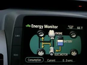
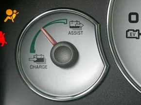
The most critical feature on any hybrid dashboard is the power flow indicator. It shows you where energy is coming from and where it’s going.
Typically, you’ll see a graphic with two sources: the fuel tank and the battery. In the middle, there’s the wheels. Arrows or bars indicate the direction and intensity of power.
- Green or blue bars usually mean electric power.
- Red or orange bars indicate gasoline engine power.
- A mix means both are working together.
Some hybrids, like the Toyota Prius or Honda Insight, use a more complex gauge that shows regenerative braking intensity. When you lift off the gas, the electric motor acts as a generator. The display will show energy flowing back into the battery. This is where you earn your miles.
If the needle stays in the red zone, you’re burning gas. If it’s in the green, you’re coasting or accelerating gently. The goal? Keep that needle in the green as much as possible.
Monitoring the State of Charge
Battery level isn’t just about range. In hybrids, it’s about efficiency.
The computer uses volt meters and amp sensors to track the battery’s state of charge (SoC). But here’s the trick: you don’t always want a full battery. You want a stable battery.
If the battery is too full, the regenerative braking system can’t store much energy when you slow down. That energy is wasted. If the battery is too low, the gasoline engine has to work harder to keep the car moving and charge the battery at the same time. That kills your MPG.
The sweet spot? Usually between 50% and 80%.
Watch the battery gauge. If it’s creeping toward full, ease off the accelerator early. Let the car coast. If it’s dropping toward empty, you might need to nudge the throttle just enough to let the engine run efficiently and top it up. It’s a constant balancing act.
Real-Time MPG as Feedback
Most hybrid dashboards show a real-time miles-per-gallon figure. It updates every second. It’s addictive.
Why? Because it gives you instant feedback. Stomp on the gas? The number drops. Anticipate the stoplight and coast? The number climbs. It’s a game, and the high score is fuel efficiency.
But don’t just chase the number. Understand why it changes.
- Hard acceleration spikes fuel consumption.
- High speeds increase aerodynamic drag, forcing the engine to work harder.
- Frequent braking wastes kinetic energy that could have been recaptured.
Why your hybrid dashboard is trying to psychoanalyze you
Most hybrid system indicators stick to the basics. MPG. Battery state. Fuel level. Boring. But manufacturers realized that raw data doesn’t change behavior. Visuals do. They wanted to make efficiency feel real. So they swapped analog needles for LCD screens and started gamifying the drive.
Take the Ford Fusion Hybrid. It uses a system called SmartGauge. Forget the speedometer being the star. It’s centered, sure, but the real action is the ring of customizable LCD displays around it. Ford drew a digital vine. You drive hard? Slam the throttle? The leaves wither. They die. You coast? Lighten up? They grow. It’s a direct, visceral feedback loop. No math required. Just greenery. Or lack thereof.
How hypermiling tips actually work on modern dashboards
This visual trickery isn’t just for show. It’s tied to a specific driving philosophy: hypermiling. Or at least, the mainstreamed version of it. The goal is efficient acceleration and deceleration. The dashboard watches your foot.
If you stomp the gas or brake too hard, the system flags it. Some clusters will literally tell you. “Too hard,” it might say. Or just turn the vine brown. It’s a nudge. A gentle, digital slap on the wrist. When you’re in the flow, driving at maximum efficiency, the system rewards you with growth or a green light. It teaches you to smooth out your inputs. Less jerking. More gliding.
Which hybrid displays track your long-term efficiency?
Ford’s vine is immediate. Other systems look at the big picture. Toyota’s Prius keeps it utilitarian. The central display handles speed, fuel, shift level, and odometer. A separate LCD multi-information panel dumps the rest: energy flow, consumption stats, inside and outside temps, audio levels. It’s dense. Information-rich. Less emotional. More engineering.
Honda went the scoring route with Eco Assist. This feature gives instantaneous feedback during the drive. But the kicker is the post-trip analysis. The computer calculates an eco score. It rates how efficient that specific trip was. It tracks your progress over time. You earn levels. Badges. Status. It turns MPG into a leaderboard.
Eco Assist provides the driver with instantaneous feedback.
Which approach works better? The dying vine or the scorecard? Probably depends on whether you respond to shame or achievement. The dashboard knows your car’s health. But it’s also trying to know you.
The data is there. The graphics are there. The question is whether you’re willing to let a screen judge your left foot.